Organic Harvest Concept Store
A Store That Smells Like Its Convictions
The challenge of designing a retail concept store for a natural beauty brand is, at its most fundamental, a problem of authenticity. The visual vocabulary of organic, sustainable, and natural commerce has been so thoroughly colonised by a particular aesthetic shorthand — reclaimed timber, Edison bulbs, linen tags, kraft paper — that the risk of cliché is ever-present. The question Bricolage Bombay faced in conceiving the Organic Harvest Concept Store was not what elements to deploy but how to deploy them with sufficient rigour and specificity to transcend the generic and arrive at something that could be mistaken for nothing other than this brand, this philosophy, this particular relationship between beauty and the natural world.
Organic Harvest is one of India’s most serious natural beauty brands — a company whose founding conviction is that effective skincare and haircare need not come at the cost of environmental or ethical compromise. Its products are formulated without parabens, sulphates, or synthetic fragrances; its supply chain is oriented toward the organic and the traceable. For such a brand, the physical retail environment is not merely a distribution channel but a philosophical statement — an opportunity to extend into three-dimensional space the values that are already encoded in the product formulation and packaging.
Warm Wood and the Grammar of the Organic
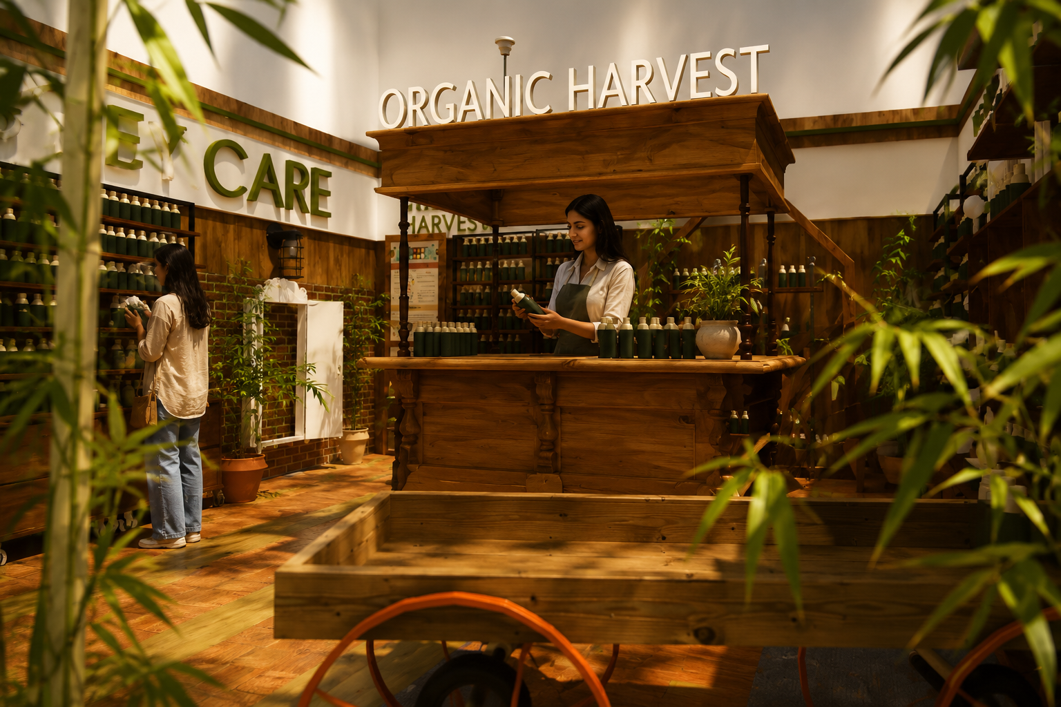
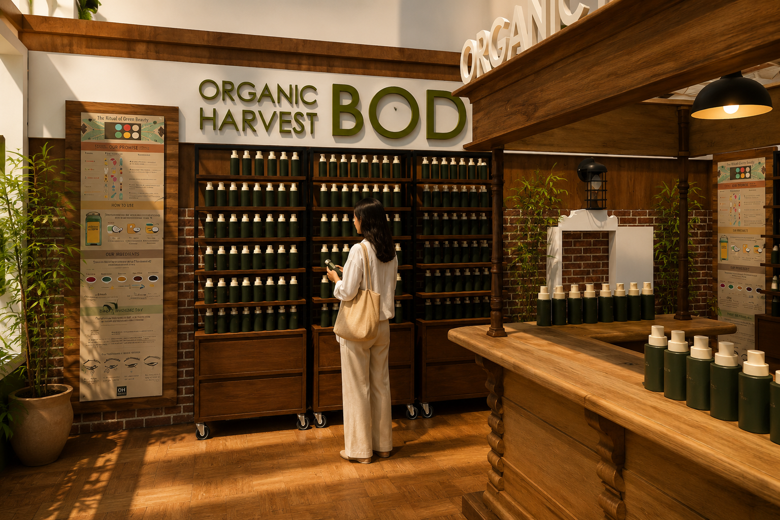
The Organic Harvest Concept Store is organised around a palette of warm, natural materials — teak timber for the floors, counters, and ceiling beams; dark-stained wood for the product shelving; bamboo and live plants as organic accents. The renders produced by Bricolage Bombay show an interior suffused with a warm amber glow — partly the inherent colour of the timber, partly the quality of the artificial light — that reads immediately as welcoming, as honest, as belonging to the register of the handmade rather than the manufactured.
The central counter is perhaps the most significant single object in the scheme. Rising from the floor as a freestanding island, it is detailed with a classically influenced carved wooden base — an inverted bracket profile that recalls the column plinths of traditional Indian vernacular architecture — surmounted by a wide timber top at which beauty consultants can engage with customers in a face-to-face configuration. This counter is simultaneously a product display surface, a point of sale, a consultation station, and a piece of furniture — it performs multiple roles with a formal clarity that speaks to the design intelligence of Bricolage Bombay’s approach to commercial interiors.
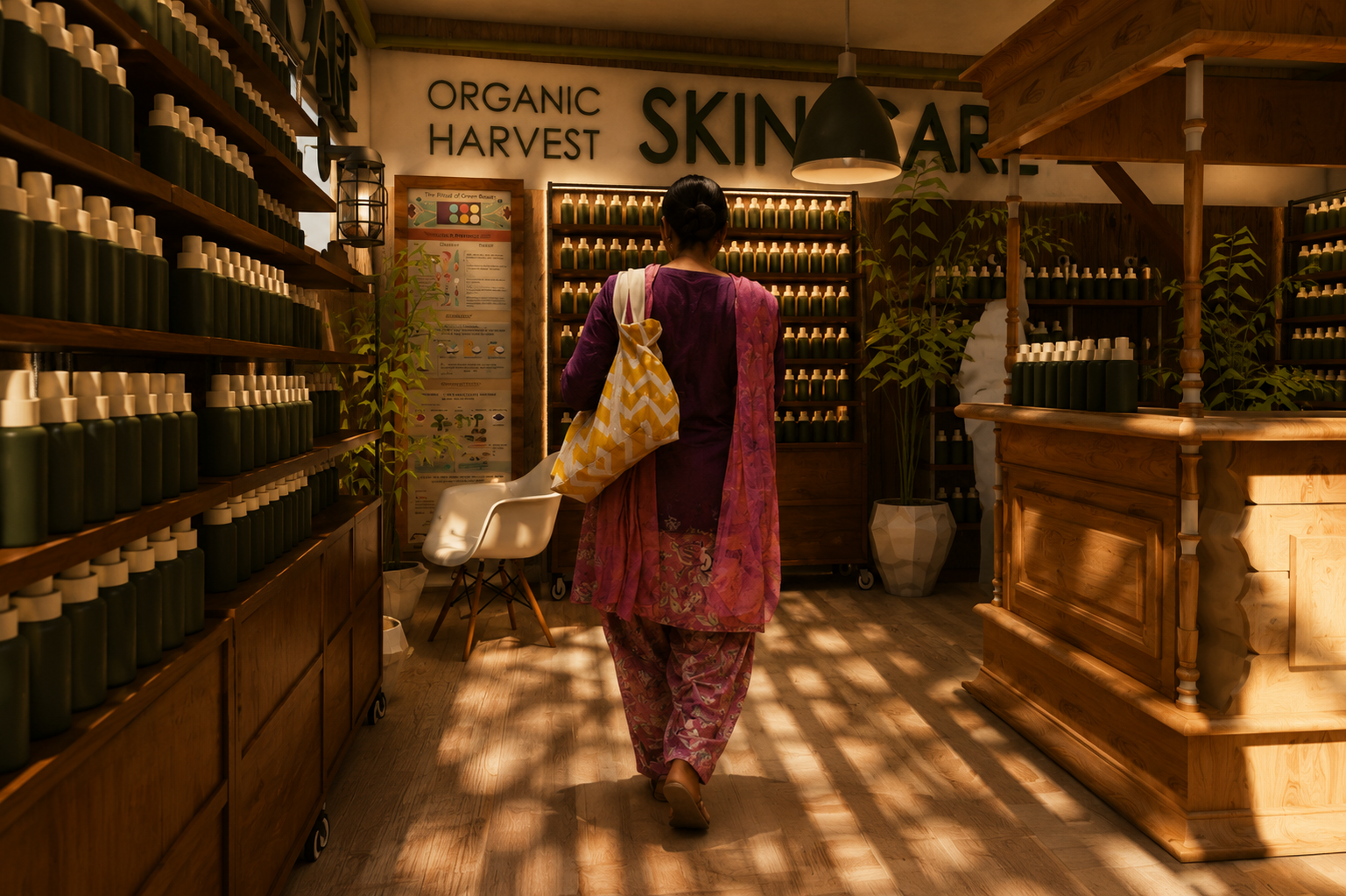
Around this central object, the shelving system deploys product in a manner simultaneously generous and ordered. The shelving runs along the perimeter walls as tall, dark-stained wooden units into which products are arranged with a density and regularity that recalls the apothecary or the herbalist rather than the supermarket. This is a crucial distinction: the apothecary aesthetic, with its associations of expertise, tradition, and remedial efficacy, is precisely the register that a natural beauty brand like Organic Harvest wishes to inhabit. The shelves do not merchandise; they prescribe.
The Categories as Spatial Signage
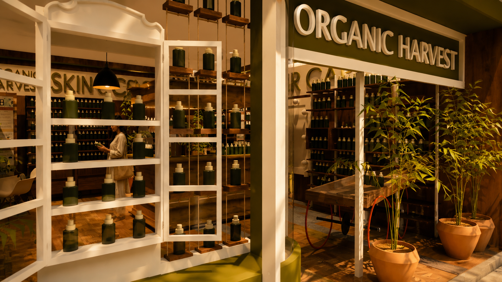
One of the more architecturally ambitious aspects of the Organic Harvest store design is the treatment of the category signage. Large-format typographic banners — SKIN CARE, HAIR CARE, BODY CARE — are applied directly to the upper walls and soffit of the store, functioning not merely as navigational aids but as architectural elements in their own right. Their scale transforms them from informational into environmental, so that standing in the store one feels surrounded by language as much as by products.
This typographic strategy is consistent with a broader understanding of retail interior design in which the brand’s verbal identity and its spatial identity are conceived as a single integrated system. The words are not applied to the space after the fact — they are part of the spatial composition from the outset, calibrated in size and placement against the other architectural elements of the scheme. The result is an interior in which the visitor is always, simultaneously, inside the space and inside the brand.
The pendant lighting fixtures — industrial-style dome pendants in blackened metal — hang at varying heights across the central zone of the store, creating a layered ceiling plane that introduces visual depth above and ensures that the product displays below are lit with the warm directional quality most flattering to the amber and olive tones of the product packaging.
Biophilic Retail Design and the Organic Ethos
The integration of living plants throughout the Organic Harvest store is not incidental — it is a design principle of the first order. In the renders, bamboo stalks rise from ceramic planters at the base of the shelving units; potted tropical foliage occupies corners and countertop positions; the overall effect is of a space in which the boundary between the natural and the constructed is kept deliberately porous. This biophilic approach to retail interior design has gained significant traction in the global luxury market.
For Organic Harvest, the plants serve an additional, brand-specific function: they are a literal manifestation of the promise encoded in the products themselves. A brand that claims fidelity to the natural world should, self-evidently, inhabit a space that reflects that fidelity. The plants are not decorative accessories but arguments — silent but visible evidence that the brand’s values are consistent across every dimension of the customer encounter, from formulation to packaging to built environment.
Bricolage Bombay’s achievement in the Organic Harvest Concept Store is to have constructed an interior that feels simultaneously aspirational and accessible, luxurious and ethical — a space in which the beauty of natural materials and the beauty of natural ingredients are experienced as aspects of the same underlying intelligence. This is experiential retail design at its most coherent: an environment that does not merely sell products but embodies a worldview, and invites the customer to share it.